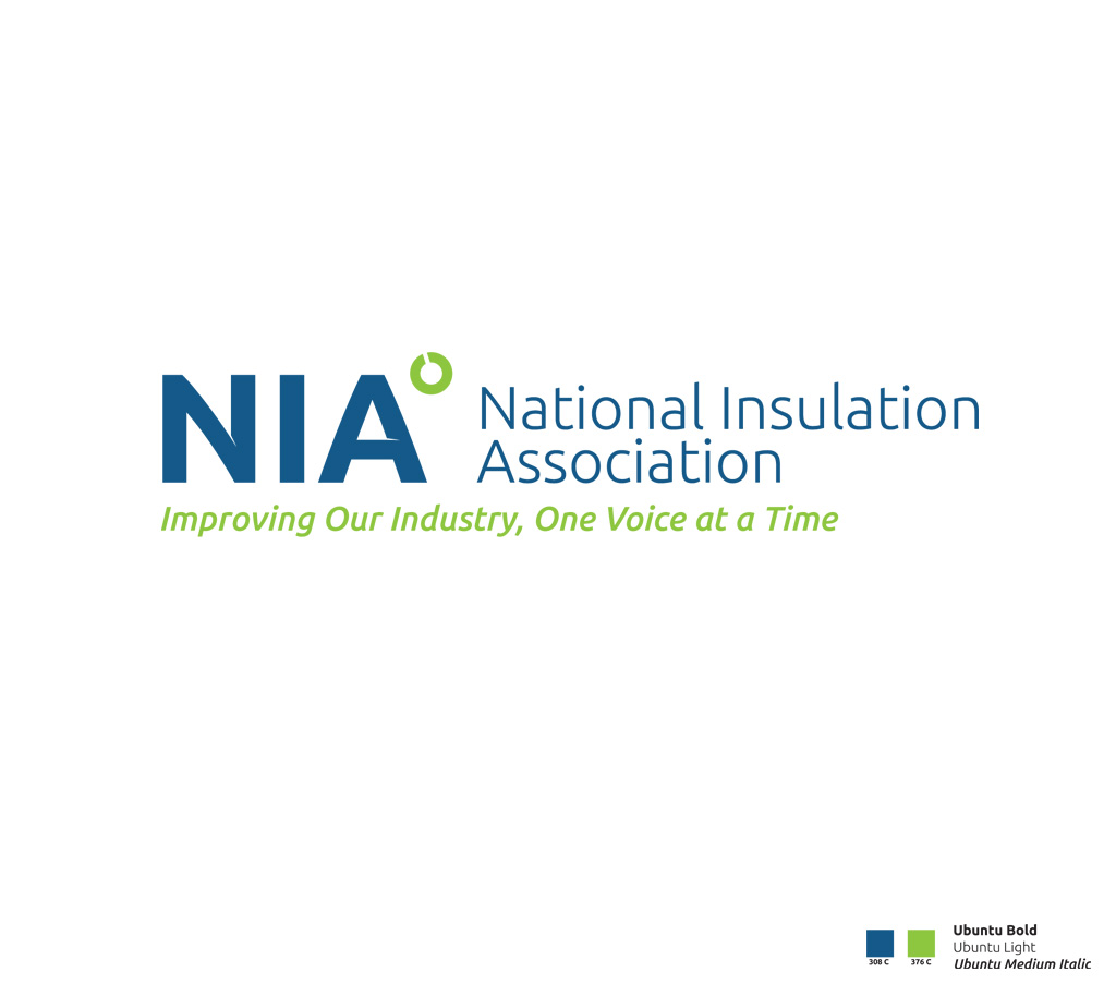
The National Insulation Association (NIA) came to me in late 2012 with the desire to freshen up their brand by updating the old logo. They wanted to bring the logo design into the 21st Century and have something that unified the brand, which is spread across the United States. There are numerous benefits to insulation that create a greener, more eco-friendly world and they were getting overlooked and overshadowed by newer emerging technologies. Within each segment their was a missing component that gives each segment the ability to be heard and to be recognized as a viable source of energy efficency. Thus the tagline. <em>Improving our Industry, One Voice at a Time.</em>
The font is a modified version of Ubuntu which conveys a fresh, modern yet technical look and feel. The part I modified was the little lines on the inside which gives it the feeling of “energy” and movement. Which typically in the insulation world it is about conserving some sort of energy. The little “degree doo-hickey” (yes I said doo-hickey) is actually a tweaked version of pipe insulation and of course the degree symbol is represented there for temperature as insulation is also used to keep things either cold or warm.
The blue and green colors were chosen to convey friendliness, professionalism, eco-friendly, cost-savings and of course energy.
Overall I have to say the NIA is positioned for success and this has to be one of my favorite logos I have done recently.

